Visualization
Unveiling Insights: The Power of Data Visualization in the World of Data Science⌗
Introduction⌗
In the ever-evolving landscape of data science, the ability to extract meaningful insights from vast datasets has become a critical factor in making informed decisions. One powerful tool that plays a pivotal role in this process is data visualization. As a leading consultancy in the field of data science, we understand the transformative impact that effective data visualization can have on businesses and organizations. In this blog post, we’ll delve into the significance of data visualization, its benefits, and best practices to harness its power for unlocking hidden patterns and trends.
The Power of Visual Storytelling⌗
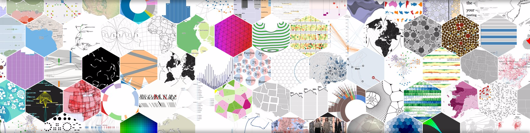
Humans are inherently visual beings, and the saying “a picture is worth a thousand words” holds true, especially in the realm of data science. Data visualization transforms complex datasets into intuitive and compelling visual representations, making it easier for stakeholders at all levels to grasp and interpret information. Whether it’s charts, graphs, heatmaps, or interactive dashboards, visual storytelling brings data to life, making it accessible and actionable.
Benefits of Data Visualization⌗
Clarity and Understanding: Visualizations simplify complex data, providing a clear and concise overview. This clarity fosters a better understanding of trends, outliers, and patterns, enabling quicker and more informed decision-making.
Communication and Collaboration: Visualizations serve as a universal language that bridges the gap between technical and non-technical stakeholders. They facilitate communication and collaboration by presenting data in a format that is easily digestible by diverse audiences.
Identification of Trends and Patterns: Patterns and trends that might be difficult to discern in raw data become evident through visual representations. This aids in identifying opportunities, mitigating risks, and optimizing strategies.
Data Exploration and Discovery: Interactive visualizations empower users to explore data dynamically. This hands-on approach facilitates the discovery of insights that may not be immediately apparent, fostering a culture of continuous exploration and learning.
Best Practices for Effective Data Visualization⌗
Know Your Audience: Tailor your visualizations to the intended audience. Consider their level of technical expertise and the specific insights they seek. A sales team may require different visualizations than a group of data scientists.
Simplicity is Key: Avoid clutter and unnecessary complexity. The goal is to convey information concisely. Use clean and simple visuals that focus on the key message without overwhelming the viewer.
Choose the Right Visualization Type: Different types of data call for different visualization methods. Whether it’s a bar chart, line graph, pie chart, or heatmap, select the visualization type that best suits the nature of your data and the story you want to tell.
Ensure Accuracy and Consistency: Accurate data representation is non-negotiable. Verify the accuracy of your data and ensure consistency in your visualizations. Misleading visualizations can lead to misguided decisions.
Conclusion⌗
As a consultancy committed to delivering cutting-edge data science services, we recognize the indispensable role of data visualization in unraveling the stories hidden within data. By harnessing the power of visual storytelling, businesses can empower their teams to make data-driven decisions with confidence. In a world inundated with data, the ability to transform raw information into actionable insights through effective visualization is a key differentiator. Embrace the art of data visualization, and unlock the true potential of your data.